Monday, August 10, 2015

What the Heck is Multivariate Analysis? Part I


In my next series of articles, I will demonstrate how to use the R statistical software to carry out some simple multivariate analyses, with a focus on principal components analysis (PCA) and linear discriminant analysis (LDA). PCA and LDA, will constitute parts II and III, respectively.
 
The first thing that you will want to do to analyze your multivariate data will be to load it into R, and to plot the data. You can load dataset into R using the require(rattle), ‘wine’ is a data set in this package. The dataset ‘wine’ contains data on concentrations of 13 different chemicals in wines grown in the same region in Italy that are derived from three different cultivars.
 
There is one row per wine sample. The first column contains the cultivar of a wine sample (labelled 1, 2 or 3), and the following thirteen columns contain the concentrations of the 13 different chemicals in that sample. The columns are separated by commas. We can load in the file using the require() function as follows:

ADVERTISEMENT
require(rattle)wine # a dataset in the rattle package
V1    V2   V3   V4   V5  V6   V7   V8   V9  V10       V11   V12  V13  V14
1    1 14.23 1.71 2.43 15.6 127 2.80 3.06 0.28 2.29  5.640000 1.040 3.92 1065
2    1 13.20 1.78 2.14 11.2 100 2.65 2.76 0.26 1.28  4.380000 1.050 3.40 1050
3    1 13.16 2.36 2.67 18.6 101 2.80 3.24 0.30 2.81  5.680000 1.030 3.17 1185
4    1 14.37 1.95 2.50 16.8 113 3.85 3.49 0.24 2.18  7.800000 0.860 3.45 1480
5    1 13.24 2.59 2.87 21.0 118 2.80 2.69 0.39 1.82  4.320000 1.040 2.93  735
...
176  3 13.27 4.28 2.26 20.0 120 1.59 0.69 0.43 1.35 10.200000 0.590 1.56  835
177  3 13.17 2.59 2.37 20.0 120 1.65 0.68 0.53 1.46  9.300000 0.600 1.62  840
178  3 14.13 4.10 2.74 24.5  96 2.05 0.76 0.56 1.35  9.200000 0.610 1.60  560


In this case the data on 178 samples of wine has been read into the variable ‘wine’.

Plotting Multivariate Data

Once you have read a multivariate data set into R, the next step is usually to make a plot of the data.

A Matrix Scatterplot

One common way of plotting multivariate data is to make a “matrix scatterplot”, showing each pair of variables plotted against each other. We can use the “scatterplotMatrix()” function from the “car” R package to do this. To use this function, we first need to install the “car” R package (for instructions on how to install an R package, see How to install an R package).
 
Once you have installed the “car” R package, you can load the “car” R package by typing:
 
> library("car")
You can then use the “scatterplotMatrix()” function to plot the multivariate data.
 
To use the scatterplotMatrix() function, you need to give it as its input the variables that you want included in the plot. Say for example, that we just want to include the variables corresponding to the concentrations of the first five chemicals. These are stored in columns 2-6 of the variable “wine”. We can extract just these columns from the variable “wine” by typing:

> wine[2:6]
V2   V3   V4   V5 V6
1   14.23 1.71 2.43 15.6 127
2   13.20 1.78 2.14 11.2 100
3   13.16 2.36 2.67 18.6 101
4   14.37 1.95 2.50 16.8 113
5   13.24 2.59 2.87 21.0 118
...

To make a matrix scatterplot of just these 13 variables using the scatterplotMatrix() function we type:
 
> scatterplotMatrix(wine[2:6])
LDA_Plot01
In this matrix scatterplot, the diagonal cells show histograms of each of the variables, in this case the concentrations of the first five chemicals (variables V2, V3, V4, V5, V6).
 
Each of the off-diagonal cells is a scatterplot of two of the five chemicals, for example, the second cell in the first row is a scatterplot of V2 (y-axis) against V3 (x-axis).

A Scatterplot with the Data Points Labelled by their Group

If you see an interesting scatterplot for two variables in the matrix scatterplot, you may want to plot that scatterplot in more detail, with the data points labelled by their group (their cultivar in this case).
For example, in the matrix scatterplot above, the cell in the third column of the fourth row down is a scatterplot of V5 (x-axis) against V4 (y-axis). If you look at this scatterplot, it appears that there may be a positive relationship between V5 and V4.
 
We may therefore decide to examine the relationship between V5 and V4 more closely, by plotting a scatterplot of these two variable, with the data points labelled by their group (their cultivar). To plot a scatterplot of two variables, we can use the “plot” R function. The V4 and V5 variables are stored in the columns V4 and V5 of the variable “wine”, so can be accessed by typing wine$V4 or wine$V5. Therefore, to plot the scatterplot, we type:

> plot(wine$V4, wine$V5)

 LDA_Plot00


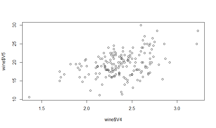
 If we want to label the data points by their group (the cultivar of wine here), we can use the “text” function in R to plot some text beside every data point. In this case, the cultivar of wine is stored in the column V1 of the variable “wine”, so we type:

> text(wine$V4, wine$V5, wine$V1, cex=0.7, pos=4, col="red")

LDA_Plot02
 
If you look at the help page for the “text” function, you will see that “pos=4” will plot the text just to the right of the symbol for a data point. The “cex=0.5” option will plot the text at half the default size, and the “col=red” option will plot the text in red. This gives us the following plot:
 
We can see from the scatterplot of V4 versus V5 that the wines from cultivar 2 seem to have lower values of V4 compared to the wines of cultivar 1.

A Profile Plot

Another type of plot that is useful is a “profile plot”, which shows the variation in each of the variables, by plotting the value of each of the variables for each of the samples.
The function “makeProfilePlot()” below can be used to make a profile plot. This function requires the “RColorBrewer” library. To use this function, we first need to install the “RColorBrewer” R package (for instructions on how to install an R package, see How to install an R package).

> makeProfilePlot {
require(RColorBrewer)
# find out how many variables we want to include numvariables # choose 'numvariables' random colours
colours # find out the minimum and maximum values of the variables: mymin mymax for (i in 1:numvariables)
{
vectori mini maxi if (mini < mymin) { mymin mymax) { mymax }
# plot the variables
for (i in 1:numvariables)
{
vectori namei colouri if (i == 1) { plot(vectori,col=colouri,type="l",ylim=c(mymin,mymax)) }
else         { points(vectori, col=colouri,type="l")                                    

}
lastxval lastyval text((lastxval-10),(lastyval),namei,col="black",cex=0.6)
}
}


To use this function, you first need to copy and paste it into R. The arguments to the function are a vector containing the names of the varibles that you want to plot, and a list variable containing the variables themselves.

For example, to make a profile plot of the concentrations of the first five chemicals in the wine samples (stored in columns V2, V3, V4, V5, V6 of variable “wine”), we type:

> library(RColorBrewer)
> names mylist makeProfilePlot(mylist,names)

LDA_Plot03
 
It is clear from the profile plot that the mean and standard deviation for V6 is quite a lot higher than that for the other variables.

Calculating Summary Statistics for Multivariate Data

Another thing that you are likely to want to do is to calculate summary statistics such as the mean and standard deviation for each of the variables in your multivariate data set.

sapply

The “sapply()” function can be used to apply some other function to each column in a data frame, eg. sapply(mydataframe,sd) will calculate the standard deviation of each column in a dataframe “mydataframe”.
 
This is easy to do, using the “mean()” and “sd()” functions in R. For example, say we want to calculate the mean and standard deviations of each of the 13 chemical concentrations in the wine samples. These are stored in columns 2-14 of the variable “wine”. So we type:
 
> sapply(wine[2:14],mean)
V2          V3          V4         V5         V6          V7
13.0006180   2.3363483   2.3665169 19.4949438 99.7415730   2.2951124
V8          V9         V10         V11         V12         V13
2.0292697   0.3618539   1.5908989   5.0580899   0.9574494   2.6116854
V14
746.8932584

This tells us that the mean of variable V2 is 13.0006180, the mean of V3 is 2.3363483, and so on.
Similarly, to get the standard deviations of the 13 chemical concentrations, we type:
 
> sapply(wine[2:14],sd)
V2          V3          V4          V5         V6          V7
0.8118265   1.1171461   0.2743440   3.3395638 14.2824835   0.6258510
V8          V9         V10         V11         V12         V13
0.9988587   0.1244533   0.5723589   2.3182859   0.2285716   0.7099904
V14
314.9074743

We can see here that it would make sense to standardize in order to compare the variables because the variables have very different standard deviations – the standard deviation of V14 is 314.9074743, while the standard deviation of V9 is just 0.1244533. Thus, in order to compare the variables, we need to standardize each variable so that it has a sample variance of 1 and sample mean of 0. We will explain below how to standardize the variables.

Means and Variances Per Group

It is often interesting to calculate the means and standard deviations for just the samples from a particular group, for example, for the wine samples from each cultivar. The cultivar is stored in the column “V1” of the variable “wine”.
 
To extract out the data for just cultivar 2, we can type:

> cultivar2wine 

 We can then calculate the mean and standard deviations of the 13 chemicals’ concentrations, for just the cultivar 2 samples:

sapply(cultivar2wine[2:14],mean)
V2       V3       V4        V5        V6       V7       V8
12.278732 1.932676 2.244789 20.238028 94.549296 2.258873 2.080845
V9      V10      V11      V12      V13        V14
0.363662 1.630282 3.086620 1.056282 2.785352 519.507042
> sapply(cultivar2wine[2:14])
V2        V3        V4        V5         V6        V7        V8
0.5379642 1.0155687 0.3154673 3.3497704 16.7534975 0.5453611 0.7057008
V9       V10       V11       V12       V13         V14
0.1239613 0.6020678 0.9249293 0.2029368 0.4965735 157.2112204

You can calculate the mean and standard deviation of the 13 chemicals’ concentrations for just cultivar 1 samples, or for just cultivar 3 samples, in a similar way.
 
However, for convenience, you might want to use the function “printMeanAndSdByGroup()” below, which prints out the mean and standard deviation of the variables for each group in your data set:

> printMeanAndSdByGroup function(variables,groupvariable)
{
# find the names of the variables
variablenames # within each group, find the mean of each variable
groupvariable # ensures groupvariable is not a list
means names(means) print(paste("Means:"))
print(means)
# within each group, find the standard deviation of each variable:
sds names(sds) print(paste("Standard deviations:"))
print(sds)
# within each group, find the number of samples:
samplesizes names(samplesizes) print(paste("Sample sizes:"))
print(samplesizes)
}

To use the function “printMeanAndSdByGroup()”, you first need to copy and paste it into R. The arguments of the function are the variables that you want to calculate means and standard deviations for, and the variable containing the group of each sample. For example, to calculate the mean and standard deviation for each of the 13 chemical concentrations, for each of the three different wine cultivars, we type:

> printMeanAndSdByGroup(wine[2:14],wine[1])
[1] "Means:"
V1      V2     V3     V4     V5        V6     V7     V8     V9    V10    V11    V12    V13       V14
1 1 13.7448 2.0107 2.4556 17.0370 106.3390 2.8402 2.9824 0.2900 1.8993 5.5283 1.0620 3.1578 1115.7119
2 2 12.2787 1.9327 2.2448 20.2380  94.5493 2.2589 2.0808 0.3637 1.6303 3.0866 1.0563 2.7854  519.5070
3 3 13.1536 3.3338 2.4371 21.4167  99.3125 1.6788 0.7815 0.4475 1.1535 7.3963 0.6827 1.6835  629.8958
[1] "Standard deviations:"
 V1     V2     V3     V4     V5      V6     V7     V8     V9    V10    V11    V12    V13      V14
1 1 0.4621 0.6885 0.2272 2.5463 10.4990 0.3390 0.3975 0.0701 0.4121 1.2386 0.1164 0.3571 221.5208
2 2 0.5380 1.0156 0.3155 3.3498 16.7535 0.5454 0.7057 0.1240 0.6021 0.9250 0.2029 0.4966 157.2112
3 3 0.5302 1.0879 0.1846 2.2582 10.8905 0.3570 0.2935 0.1241 0.4088 2.3101 0.1144 0.2721 115.0970

[1] "Sample sizes:"
V1 V2 V3 V4 V5 V6 V7 V8 V9 V10 V11 V12 V13 V14
1 1  59 59 59 59 59 59 59 59  59  59 59 59 59
2 2  71 71 71 71 71 71 71 71  71  71 71 71 71
3 3  48 48 48 48 48 48 48 48  48  48 48 48 48

The function “printMeanAndSdByGroup()” also prints out the number of samples in each group. In this case, we see that there are 59 samples of cultivar 1, 71 of cultivar 2, and 48 of cultivar 3.

Between-groups Variance and Within-groups Variance for a Variable

If we want to calculate the within-groups variance for a particular variable (for example, for a particular chemical’s concentration), we can use the function “calcWithinGroupsVariance()” below:
 
> calcWithinGroupsVariance function(variable,groupvariable){
# find out how many values the group variable can take
groupvariable2 levels numlevels # get the mean and standard deviation for each group:
numtotal denomtotal for (i in 1:numlevels)
{
leveli levelidata levelilength # get the standard deviation for group i: sdi numi denomi numtotal denomtotal }
# calculate the within-groups variance
Vw return(Vw)
}


You will need to copy and paste this function into R before you can use it. For example, to calculate the within-groups variance of the variable V2 (the concentration of the first chemical), we type:
> calcWithinGroupsVariance(wine[2],wine[1])
[1] 0.2620525

Thus, the within-groups variance for V2 is 0.2620525.
 
We can calculate the between-groups variance for a particular variable (eg. V2) using the function “calcBetweenGroupsVariance()” below:

> calcBetweenGroupsVariance function(variable,groupvariable){
# find out how many values the group variable can take groupvariable2 levels numlevels # calculate the overall grand mean: grandmean # get the mean and standard deviation for each group: numtotal denomtotal for (i in 1:numlevels)
{
leveli levelidata levelilength # get the mean and standard deviation for group i:
meani sdi numi denomi numtotal denomtotal }
# calculate the between-groups variance Vb Vb return(Vb)
}


Once you have copied and pasted this function into R, you can use it to calculate the between-groups variance for a variable such as V2:
 
> calcBetweenGroupsVariance (wine[2],wine[1])
[1] 35.39742

Thus, the between-groups variance of V2 is 35.39742.
We can calculate the “separation” achieved by a variable as its between-groups variance divided by its within-groups variance. Thus, the separation achieved by V2 is calculated as:

> 35.39742/0.2620525
[1] 135.0776

If you want to calculate the separations achieved by all of the variables in a multivariate data set, you can use the function “calcSeparations()” below:
 
> calcSeparations function(variables,groupvariable){
# find out how many variables we have variables numvariables # find the variable names variablenames # calculate the separation for each variable for (i in 1:numvariables)
{
variablei variablename Vw Vb sep print(paste("variable",variablename,"Vw=",Vw,"Vb=",Vb,"separation=",sep))
}
}


For example, to calculate the separations for each of the 13 chemical concentrations, we type:

> calcSeparations(wine[2:14],wine[1])
[1] "variable  V2 Vw= 0.2620524692 Vb= 35.39742496027 separation= 135.07762424"
[1] "variable  V3 Vw= 0.8875467967 Vb= 32.78901848692 separation= 36.943424963"
[1] "variable  V4 Vw= 0.0660721013 Vb= 0.879611357249 separation= 13.312901199"
[1] "variable  V5 Vw= 8.0068111812 Vb= 286.4167463631 separation= 35.771637407"
[1] "variable  V6 Vw= 180.65777316 Vb= 2245.501027890 separation= 12.429584338"
[1] "variable  V7 Vw= 0.1912704752 Vb= 17.92835729429 separation= 93.733009620"
[1] "variable  V8 Vw= 0.2747075143 Vb= 64.26119502356 separation= 233.92587268"
[1] "variable  V9 Vw= 0.0119117022 Vb= 0.328470157461 separation= 27.575417146"
[1] "variable V10 Vw= 0.2461729438 Vb= 7.451995507778 separation= 30.271383170"
[1] "variable V11 Vw= 2.2849230813 Vb= 275.7080008223 separation= 120.66401844"
[1] "variable V12 Vw= 0.0244876469 Vb= 2.481009914938 separation= 101.31679539"
[1] "variable V13 Vw= 0.1607787296 Vb= 30.54350835443 separation= 189.97232058"
[1] "variable V14 Vw= 29707.681871 Vb= 6176832.322285 separation= 207.92037390"

Thus, the individual variable which gives the greatest separations between the groups (the wine cultivars) is V8 (separation 233.9). As we will discuss below, the purpose of linear discriminant analysis (LDA) is to find the linear combination of the individual variables that will give the greatest separation between the groups (cultivars here). This hopefully will give a better separation than the best separation achievable by any individual variable (233.9 for V8 here).

Between-groups Covariance and Within-groups Covariance for Two Variables

If you have a multivariate data set with several variables describing sampling units from different groups, such as the wine samples from different cultivars, it is often of interest to calculate the within-groups covariance and between-groups variance for pairs of the variables.
 
This can be done using the following functions, which you will need to copy and paste into R to use them:

> calcWithinGroupsCovariance function(variable1,variable2,groupvariable){
# find out how many values the group variable can take
groupvariable2 levels numlevels # get the covariance of variable 1 and variable 2 for each group:
Covw for (i in 1:numlevels)
{
leveli levelidata1 levelidata2 mean1 mean2 levelilength # get the covariance for this group:
term1 for (j 1:levelilength)
{
term1 }
Cov_groupi # covariance for this group
Covw }
totallength Covw return(Covw)
}


For example, to calculate the within-groups covariance for variables V8 and V11, we type:

> calcWithinGroupsCovariance(wine[8],wine[11],wine[1])
[1] 0.2866783
> calcBetweenGroupsCovariance function(variable1,variable2,groupvariable)
{
# find out how many values the group variable can take
groupvariable2 levels numlevels # calculate the grand means
variable1mean variable2mean # calculate the between-groups covariance
Covb for (i in 1:numlevels)
{
leveli levelidata1 levelidata2 mean1 mean2 levelilength term1 Covb }
Covb Covb return(Covb)
}


For example, to calculate the between-groups covariance for variables V8 and V11, we type:

> calcBetweenGroupsCovariance(wine[8],wine[11],wine[1])
[1] -60.41077

Thus, for V8 and V11, the between-groups covariance is -60.41 and the within-groups covariance is 0.29. Since the within-groups covariance is positive (0.29), it means V8 and V11 are positively related within groups: for individuals from the same group, individuals with a high value of V8 tend to have a high value of V11, and vice versa. Since the between-groups covariance is negative (-60.41), V8 and V11 are negatively related between groups: groups with a high mean value of V8 tend to have a low mean value of V11, and vice versa.

Calculating Correlations for Multivariate Data

It is often of interest to investigate whether any of the variables in a multivariate data set are significantly correlated.
 
To calculate the linear (Pearson) correlation coefficient for a pair of variables, you can use the “cor.test()” function in R. For example, to calculate the correlation coefficient for the first two chemicals’ concentrations, V2 and V3, we type:

> cor.test(wine$V2, wine$V3)  Pearson's product-moment correlation
data: wine$V2 and wine$V3
t = 1.2579, df = 176, p-value = 0.2101
alternative hypothesis: true correlation is not equal to 0
95 percent confidence interval:
-0.05342959 0.23817474
sample estimates:
cor
0.09439694

This tells us that the correlation coefficient is about 0.094, which is a very weak correlation. Furthermore, the P-value for the statistical test of whether the correlation coefficient is significantly different from zero is 0.21. This is much greater than 0.05 (which we can use here as a cutoff for statistical significance), so there is very weak evidence that that the correlation is non-zero.
 
If you have a lot of variables, you can use “cor.test()” to calculate the correlation coefficient for each pair of variables, but you might be just interested in finding out what are the most highly correlated pairs of variables. For this you can use the function “mosthighlycorrelated()” below.
 
The function “mosthighlycorrelated()” will print out the linear correlation coefficients for each pair of variables in your data set, in order of the correlation coefficient. This lets you see very easily which pair of variables are most highly correlated.

> mosthighlycorrelated function(mydataframe,numtoreport)
{
# find the correlations
cormatrix # set the correlations on the diagonal or lower triangle to zero,
# so they will not be reported as the highest ones:
diag(cormatrix) cormatrix[lower.tri(cormatrix)] # flatten the matrix into a dataframe for easy sorting
fm # assign human-friendly names
names(fm) # sort and print the top n correlations
head(fm[order(abs(fm$Correlation),decreasing=T),],n=numtoreport)
}

To use this function, you will first have to copy and paste it into R. The arguments of the function are the variables that you want to calculate the correlations for, and the number of top correlation coefficients to print out (for example, you can tell it to print out the largest ten correlation coefficients, or the largest 20).
 
For example, to calculate correlation coefficients between the concentrations of the 13 chemicals in the wine samples, and to print out the top 10 pairwise correlation coefficients, you can type:

> mosthighlycorrelated(wine[2:14], 10)
First.Variable Second.Variable Correlation
84             V7              V8   0.8645635
150             V8             V13   0.7871939
149             V7             V13   0.6999494
111             V8             V10   0.6526918
157             V2             V14   0.6437200
110             V7             V10   0.6124131
154            V12             V13   0.5654683
132             V3             V12  -0.5612957
118             V2             V11   0.5463642
137             V8             V12   0.5434786

This tells us that the pair of variables with the highest linear correlation coefficient are V7 and V8 (correlation = 0.86 approximately).

Standardizing Variables

If you want to compare different variables that have different units, are very different variances, it is a good idea to first standardize the variables.
 
For example, we found above that the concentrations of the 13 chemicals in the wine samples show a wide range of standard deviations, from 0.1244533 for V9 (variance 0.01548862) to 314.9074743 for V14 (variance 99166.72). This is a range of approximately 6,402,554-fold in the variances.
 
As a result, it is not a good idea to use the unstandardized chemical concentrations as the input for a principal component analysis (PCA, see below) of the wine samples, as if you did that, the first principal component would be dominated by the variables which show the largest variances, such as V14.
 
Thus, it would be a better idea to first standardize the variables so that they all have variance 1 and mean 0, and to then carry out the principal component analysis on the standardized data. This would allow us to find the principal components that provide the best low-dimensional representation of the variation in the original data, without being overly biased by those variables that show the most variance in the original data.

You can standardize variables in R using the “scale()” function.
 
For example, to standardize the concentrations of the 13 chemicals in the wine samples, we type:

> standardizedconcentrations 

Note that we use the “as.data.frame()” function to convert the output of “scale()” into a “data frame”, which is the same type of R variable that the “wine” variable.

We can check that each of the standardized variables stored in “standardizedconcentrations” has a mean of 0 and a standard deviation of 1 by typing:

> sapply(standardizedconcentrations,mean)
V2           V3           V4           V5           V6           V7
-8.591766e-16 -6.776446e-17 8.045176e-16 -7.720494e-17 -4.073935e-17 -1.395560e-17
V8           V9         V10           V11           V12           V13
6.958263e-17 -1.042186e-16 -1.221369e-16 3.649376e-17 2.093741e-16 3.003459e-16
V14
-1.034429e-16
> sapply(standardizedconcentrations,sd)
V2 V3  V4  V5  V6  V7  V8  V9 V10 V11 V12 V13 V14
1  1   1   1   1   1   1   1   1   1   1   1   1


We see that the means of the standardized variables are all very tiny numbers and so are essentially equal to 0, and the standard deviations of the standardized variables are all equal to 1.


Authored by: Jeffrey Strickland, Ph.D.

Jeffrey Strickland, Ph.D., is the Author of “Predictive Analytics Using R” and a Senior Analytics Scientist with Clarity Solution Group. He has performed predictive modeling, simulation and analysis for the Department of Defense, NASA, the Missile Defense Agency, and the Financial and Insurance Industries for over 20 years. Jeff is a Certified Modeling and Simulation professional (CMSP) and an Associate Systems Engineering Professional. He has published nearly 200 blogs on LinkedIn, is also a frequently invited guest speaker and the author of 20 books including:
  • Operations Research using Open-Source Tools
  • Discrete Event simulation using ExtendSim
  • Crime Analysis and Mapping
  • Missile Flight Simulation
  • Mathematical Modeling of Warfare and Combat Phenomenon
  • Predictive Modeling and Analytics
  • Using Math to Defeat the Enemy
  • Verification and Validation for Modeling and Simulation
  • Simulation Conceptual Modeling
  • System Engineering Process and Practices
  • Weird Scientist: the Creators of Quantum Physics
  • Albert Einstein: No one expected me to lay a golden eggs
  • The Men of Manhattan: the Creators of the Nuclear Era
  • Fundamentals of Combat Modeling
  • LinkedIn Memoirs
  • Quantum Phaith
  • Dear Mister President
  • Handbook of Handguns
  • Knights of the Cross: The True Story of the Knights Templar
Connect with Jeffrey StricklandContact Jeffrey Strickland

A 12 Step Approach to Analytical Modeling

 
This article first appeared on bicorner.com
  1. Define the problem – Defining the problem is necessary. Defining the “right” problem is absolutely critical, otherwise you’re just wasting everyone’s time. However, the customers you are working for may not know how to express the real problem or may not know what the problem really is. The Operations Research Analyst must ask the right questions and draw the right problem out form where it may be hiding.
  2. Define the Business case – Once you identify the real problem, you have to help answer the question, “Is the problem worth solving (or at least worth the OR analyst’s involvement)?”. That may sound odd, but if the problem statement is not translated in to a business case, then the business does not need the problem solved badly enough to warrant the time and effort to solve it. We have to ask, “What is it worth to the business?” Increased profit? Improved production? Savings of marketing dollars?
  3. Define the Model Objective – It takes a well-defined problem and solid business case to ensure that we build the right model or provide the right solution. In my earlier years, I often found myself halfway through a project before realizing I was not building the right model. A model objective that answers the call of the business case is essential. It will keep you on course.
  4. Determine the requirements – We have a well-defined problem, a business case with a supporting model objective, so now let’s go and build the model. Slow down! What are the requirements? Do you have the tools you need, the team you need, and the budget to support it? If data is to be used, do you have access to it, has it been processed, and is it in the right format? We have to determine the requirements or we may fail due to some oversight.
  5. Gather the Data – If data is necessary, it will probably not be handed to you on a silver platter ready for consumption. It may be “dirty”, in the wrong format, incomplete, of just not right. If you have fully identified the requirements, you will already know what has to be accomplished at this stage.
  6. Process the Data – This is where you may spend an abundant amount of time. If you do not have clean, complete, and reliable data, you are doomed. You may have to remove inconsistencies, impute missing values, and so on. Then you have to analyze the data, perform data reduction, and integrate the data so that it is ready for use. Modeling with “bad” data results in a “bad” model!
  7. Build the Model – So, you have done the hard part and it’s time to have fun. Building the model is an iterative process. I doubt that anyone ever uses the first model they build. If they do, they probably should not. There is as much art as there is science in model development. Modeler judgment is as important as p-values, and Chi-square tests. If the model does not make sense to you—is not intuitive—then it is probably not the final model.
  8. Interpret the Model Results – Here is where we often have the most difficulty as analysts. We understand the mathematical and statistical interpretation of results, but we have to go beyond that and translate it to the customer’s language. They are not going to get the significance of the odds ratio of variable X. If you start thinking about that here, it will make life less painful later on.
  9. Validate the Model for Production – This is purely a scientific task. The model must be documented every step of the way and then stand up to the scrutiny of stress testing, peer review, and so on. This is where you find out if you really did build the right model, and you built it right.
  10. Perform an Economic Analysis – Here is where you answer the call of the business case. You must translate the results to dollars, the economic benefit of the solution, or another metric if savings or profit are not objectives. For instance, the military OR may be saving lives instead of dollars.
  11. Present the Results – If you bothered to interpret the results and translate them to “customer speak”, this part is easy. But, you are not just presenting results, you are selling the solution. If your work and your recommendations are not implemented, you just wasted a lot of time, effort and money.
  12. Follow-up – Too often we fix the problem and go back to our lives or onto another problem, but following up with the customer to evaluate the effectiveness of the solution you provided is just as important as the solution that you provided. It is especially important if you want to ever see that customer again.
  13. Conclusion
    So there is my view of model building. I have built just about every kind of model: linear programs, nonlinear programs, machine learning models, statistical models, Markov transition models, and so on. I have built models of unmanned aerial vehicles, space launch vehicles, communications networks, software systems, propensity to buy a product, call center operations, combat phenomena, and so on. And I have, more than I would like to admit, built the wrong model. Hopefully, this will help the modeler step out on the right foot, and help the model recipient know what to look for when asking for a modeling solution.

Jeffrey Strickland
Authored by:Jeffrey Strickland, Ph.D.
Jeffrey Strickland, Ph.D., is the Author of Predictive Analytics Using R and a Senior Analytics Scientist with Clarity Solution Group. He has performed predictive modeling, simulation and analysis for the Department of Defense, NASA, the Missile Defense Agency, and the Financial and Insurance Industries for over 20 years. Jeff is a Certified Modeling and Simulation professional (CMSP) and an Associate Systems Engineering Professional (ASEP). He has published nearly 200 blogs on LinkedIn, is also a frequently invited guest speaker and the author of 20 books including:
  • Operations Research using Open-Source Tools
  • Discrete Event simulation using ExtendSim
  • Crime Analysis and Mapping
  • Missile Flight Simulation
  • Mathematical Modeling of Warfare and Combat Phenomenon
  • Predictive Modeling and Analytics
  • Using Math to Defeat the Enemy
  • Verification and Validation for Modeling and Simulation
  • Simulation Conceptual Modeling
  • System Engineering Process and Practices
Connect with Jeffrey StricklandContact Jeffrey Strickland

Naïve Bayes using R

http://www.lulu.com/shop/jeffrey-strickland/predictive-analytics-using-r/hardcover/product-22000910.html
This article was first published on bicorner.com

The following is an excerpt from Predictive Analytics using R, Copyright 2015 by Jeffrey Strickland
In machine learning, Naïve Bayes classifiers are a family of simple probabilistic classifiers based on applying Bayes’ theorem with strong (naïve) independence assumptions between the features.
Naïve Bayes is a popular (baseline) method for text categorization, the problem of judging documents as belonging to one category or the other (such as spam or legitimate, sports or politics, etc.) with word frequencies as the features. With appropriate preprocessing, it is competitive in this domain with more advanced methods including support vector machines (Rennie, Shih, Teevan, & Karger, 2003).

Training Naïve Bayes can be done by evaluating an approximation algorithm in closed form in linear time, rather than by expensive iterative approximation.

Introduction

In simple terms, a Naïve Bayes classifier assumes that the value of a particular feature is unrelated to the presence or absence of any other feature, given the class variable. For example, a fruit may be considered to be an apple if it is red, round, and about 3” in diameter. A Naïve Bayes classifier considers each of these features to contribute independently to the probability that this fruit is an apple, regardless of the presence or absence of the other features.

ADVERTISEMENT
For some types of probability models, Naïve Bayes classifiers can be trained very efficiently in a supervised learning setting. In many practical applications, parameter estimation for Naïve Bayes models uses the method of maximum likelihood; in other words, one can work with the Naïve Bayes model without accepting Bayesian probability or using any Bayesian methods.

Despite their naïve design and apparently oversimplified assumptions, Naïve Bayes classifiers have worked quite well in many complex real-world situations. In 2004, an analysis of the Bayesian classification problem showed that there are sound theoretical reasons for the apparently implausible efficacy of Naïve Bayes classifiers (Zhang, 2004). Still, a comprehensive comparison with other classification algorithms in 2006 showed that Bayes classification is outperformed by other approaches, such as boosted trees or random forests (Caruana & Niculescu-Mizil, 2006).

An advantage of Naïve Bayes is that it only requires a small amount of training data to estimate the parameters (means and variances of the variables) necessary for classification. Because independent variables are assumed, only the variances of the variables for each class need to be determined and not the entire covariance matrix.

Discussion

Despite the fact that the far-reaching independence assumptions are often inaccurate, the Naïve Bayes classifier has several properties that make it surprisingly useful in practice. In particular, the decoupling of the class conditional feature distributions means that each distribution can be independently estimated as a one-dimensional distribution. This helps alleviate problems stemming from the curse of dimensionality, such as the need for data sets that scale exponentially with the number of features. While Naïve Bayes often fails to produce a good estimate for the correct class probabilities, this may not be a requirement for many applications. For example, the Naïve Bayes classifier will make the correct MAP decision rule classification so long as the correct class is more probable than any other class. This is true regardless of whether the probability estimate is slightly, or even grossly inaccurate. In this manner, the overall classifier can be robust enough to ignore serious deficiencies in its underlying naïve probability model. Other reasons for the observed success of the Naïve Bayes classifier are discussed in the literature cited below.

Example Using R

The Iris dataset is pre-installed in R, since it is in the standard datasets package. To access its documentation, click on ‘Packages’ at the top-level of the R documentation, then on ‘datasets’ and then on ‘iris’. As explained, there are 150 data points and 5 variables. Each data point concerns a particular iris flower and gives 4 measurements of the flower: Sepal.Length, Sepal.Width, Petal.Length and Petal.Width together with the flower’s Species. The goal is to build a classifier that predicts species from the 4 measurements, so species is the class variable.
To get the iris dataset into your R session, do:
> data(iris)
at the R prompt. As always, it makes sense to look at the data. The following R command (from the Wikibook) does a nice job of this.
> pairs(iris[1:4],main=“Iris Data
+   (red=setosa,green=versicolor,blue=virginica)”, pch=21,
+   bg=c(“red”,”green3”,”blue”)[unclass(iris$Species)])
The ‘pairs’ command creates a scatterplot. Each dot is a data point and its position is determined by the values that data point has for a pair of variables. The class determines the color of the data point. From the plot note that Setosa irises have smaller petals than the other two species.
Bayes01
Typing:
> summary(iris)
provides a summary of the data.
 Sepal.Length     Sepal.Width    Petal.Length     Petal.Width        Species
Min.   :4.300   Min.   :2.000   Min.   :1.000   Min.   :0.100   setosa   :50
1st Qu.:5.100   1st Qu.:2.800   1st Qu.:1.600   1st Qu.:0.300  versicolor:50
Median :5.800   Median :3.000   Median :4.350   Median :1.300  virginica :50
Mean   :5.843   Mean   :3.057   Mean   :3.758   Mean   :1.199
3rd Qu.:6.400   3rd Qu.:3.300   3rd Qu.:5.100   3rd Qu.:1.800
Max.   :7.900   Max.   :4.400   Max.   :6.900   Max.   :2.500
Typing:
> iris
Prints out the entire dataset to the screen.
Sepal.Length  Sepal.Width   Petal.Length  Petal.Width     Species
1        5.1          3.5            1.4          0.2      setosa
2        4.9          3              1.4          0.2      setosa
3        4.7          3.2            1.3          0.2      setosa
4        4.6          3.1            1.5          0.2      setosa
5        5            3.6            1.4          0.2      setosa
-----------------------------Data omitted-------------------------
149      6.2          3.4            5.4          2.3      virginica
150      5.9          3              5.1          1.8      virginica

Constructing a Naïve Bayes classifier

We will use the e1071 R package to build a Naïve Bayes classifier. Firstly you need to download the package (since it is not pre-installed here). Do:
> install.packages(“e1071”)
Choose a mirror in US from the menu that will appear. You will be prompted to create a personal R library (say yes) since you don’t have permission to put e1071 in the standard directory for R packages.

To (1) load e1071 into your workspace (2) build a Naïve Bayes classifier and (3) make some predictions on the training data, do:
> library(e1071)
> classifier<-naivebayes br="" iris="">> table(predict(classifier, iris[,-5]), iris[,5],
+     dnn=list(‘predicted’,’actual’))
As you should see the classifier does a pretty good job of classifying. Why is this not surprising?
predicted   setosa versicolor virginica
setosa          50          0         0
versicolor       0         47         3
virginica        0          3        47
To see what’s going on ‘behind-the-scenes’, first do:
> classifier$apriori
This gives the class distribution in the data: the prior distribution of the classes. (‘A priori’ is Latin for ‘from before’.)
iris[, 5]
setosa  versicolor  virginica
50          50         50
Since the predictor variables here are all continuous, the Naïve Bayes classifier generates three Gaussian (Normal) distributions for each predictor variable: one for each value of the class variable Species. If you type:
> classifier$tables$Petal.Length
You will see the mean (first column) and standard deviation (second column) for the 3 class-dependent Gaussian distributions:
Petal.Length
iris[, 5]    [,1]       [,2]
setosa      1.462  0.1736640
versicolor  4.260  0.4699110
virginica   5.552  0.5518947
You can plot these three distributions against each other with the following three R commands:
> plot(function(x) dnorm(x, 1.462, 0.1736640), 0, 8,
+   col=“red”, main=“Petal length distribution for the 3
+   different species”)
> curve(dnorm(x, 4.260, 0.4699110), add=TRUE, col=“blue”)
> curve(dnorm(x, 5.552, 0.5518947), add=TRUE, col=“green”)
Note that setosa irises (the red curve) tend to have smaller petals (mean value = 1.462) and there is less variation in petal length (standard deviation is only 0.1736640).
Bayes02

Understanding Naïve Bayes

In the previous example you were given a recipe which allowed you to construct a Naïve Bayes classifier. This was for a case where we had continuous predictor variables. In this question you have to work out what the parameters of a Naïve Bayes model should be for some discrete data.

The dataset in question is called HairEyeColor and has three variables: Sex, Eye and Hair, giving values for these 3 variables for each of 592 students from the University of Delaware. First have a look at the numbers:
> HairEyeColor 
, , Sex = Male
Eye
Hair   Brown Blue Hazel Green
Black     32   11    10     3
Brown     53   50    25    15
Red       10   10     7     7
Blond      3   30     5     8

, , Sex = Female
Eye
Hair   Brown Blue Hazel Green
Black     36    9     5     2
Brown     66   34    29    14
Red       16    7     7     7
Blond      4   64     5     8
You can also plot it as a ‘mosaic’ plot which uses rectangles to represent the numbers in the data:
> mosaicplot(HairEyeColor) 
Mosaic plot
Bayes03
Your job here is to compute the parameters for a Naïve Bayes classifier which attempts to predict Sex from the other two variables. The parameters should be estimated using maximum likelihood. To save you the tedium of manual counting, here’s how to use margin.table to get the counts you need:
> margin.table(HairEyeColor,3)
  Sex
Male Female
279     313

> margin.table(HairEyeColor,c(1,3))Sex
Hair   Male  Female
Black    56     52
Brown   143    143
Red      34     37
Blond    46     81
Note that Sex is variable 3, and Hair is variable 1. Once you think you have the correct parameters speak to me or one of the demonstrators to see if you have it right. (Or if you can manage it, construct the Naïve Bayes model using the naiveBayes function and yank out the parameters from the model. Read the documentation to do this.)

We can also perform Naïve Bayes with the Classification and Visualization (klaR) package which was not covered in this article.

Authored by: Jeffrey Strickland, Ph.D.

Jeffrey Strickland, Ph.D., is the Author of Predictive Analytics Using R and a Senior Analytics Scientist with Clarity Solution Group. He has performed predictive modeling, simulation and analysis for the Department of Defense, NASA, the Missile Defense Agency, and the Financial and Insurance Industries for over 20 years. Jeff is a Certified Modeling and Simulation professional (CMSP) and an Associate Systems Engineering Professional (ASEP). He has published nearly 200 blogs on LinkedIn, is also a frequently invited guest speaker and the author of 20 books including:
  • Operations Research using Open-Source Tools
  • Discrete Event simulation using ExtendSim
  • Crime Analysis and Mapping
  • Missile Flight Simulation
  • Mathematical Modeling of Warfare and Combat Phenomenon
  • Predictive Modeling and Analytics
  • Using Math to Defeat the Enemy
  • Verification and Validation for Modeling and Simulation
  • Simulation Conceptual Modeling
  • System Engineering Process and Practices
Connect with Jeffrey StricklandContact Jeffrey Strickland

Sunday, August 9, 2015

What is Time-Series Analysis, Part 2?

 
This article first appeared on bicorner.com

In my last article I talked about Time Series Analysis using R and left with simple exponential smoothing. Here I want to talk about more advanced smoothing methods.

Holt’s Exponential Smoothing

If you have a time series that can be described using an additive model with increasing or decreasing trend and no seasonality, you can use Holt’s exponential smoothing to make short-term forecasts.
 
Holt’s exponential smoothing estimates the level and slope at the current time point. Smoothing is controlled by two parameters, alpha, for the estimate of the level at the current time point, and beta for the estimate of the slope b of the trend component at the current time point. As with simple exponential smoothing, the parameters alpha and beta have values between 0 and 1, and values that are close to 0 mean that little weight is placed on the most recent observations when making forecasts of future values.
 
ADVERTISEMENT
An example of a time series that can probably be described using an additive model with a trend and no seasonality is the time series of US Treasury bill contracts on the Chicago market for 100 consecutive trading days in 1981.
 
We can read in and plot the data in R by typing:
 
> install.packages("fma")
> ustreasseries > plot.ts(ustreasseries)
 
TS_Plot1
 
To make forecasts, we can fit a predictive model using the HoltWinters() function in R. To use HoltWinters() for Holt’s exponential smoothing, we need to set the parameter gamma=FALSE (the gamma parameter is used for Holt-Winters exponential smoothing, as described below).
 
For example, to use Holt’s exponential smoothing to fit a predictive model for US Treasury bill contracts, we type:
 
> ustreasseriesforecasts ustreasseriesforecasts
Holt-Winters exponential smoothing with trend and without seasonal component.
Call:
HoltWinters(x = ustreasseries, gamma = FALSE) Smoothing parameters:
alpha:
1 beta : 0.01073
gamma: FALSE
Coefficients:
[,1]
a 85.32000000
b -0.04692665
> ustreasseriesforecasts$SSE
[1] 8.707433
 
The estimated value of alpha is 1.0, and of beta is 0.0107. These are both high, telling us that both the estimate of the current value of the level, and of the slope b of the trend component, are based mostly upon very recent observations in the time series. This makes good intuitive sense, since the level and the slope of the time series both change quite a lot over time. The value of the sum-of-squared-errors for the in-sample forecast errors is 8.707.
 
We can plot the original time series as a black line, with the forecasted values as a red line on top of that, by typing:
 
> plot(ustreasseriesforecasts)
 
 TS_Plot2
 
We can see from the picture that the in-sample forecasts agree pretty well with the observed values, although they tend to lag behind the observed values a little bit.
 
If you wish, you can specify the initial values of the level and the slope b of the trend component by using the “l.start” and “b.start” arguments for the HoltWinters() function. It is common to set the initial value of the level to the first value in the time series (92 for the Chicago market data), and the initial value of the slope to the second value minus the first value (0.1 for the Chicago market data). For example, to fit a predictive model to the Chicago market data using Holt’s exponential smoothing, with initial values of 608 for the level and 0.1 for the slope b of the trend component, we type:
 
> HoltWinters(ustreasseries, gamma=FALSE, l.start=92, b.start=0.1)
Holt-Winters exponential smoothing with trend and without seasonal component.
Call:
HoltWinters(x = ustreasseries, gamma = FALSE, l.start = 92, b.start = 0.1)
Smoothing parameters:
alpha: 1
beta : 0.04529601
gamma: FALSE
Coefficients:
[,1]
a 85.32000000
b -0.08157293
> ustreasseriesforecasts$SSE
[1] 8.707433
As for simple exponential smoothing, we can make forecasts for future times not covered by the original time series by using the forecast.HoltWinters() function in the “forecast” package. For example, our time series data for the Chicago market was for 0 to 100 days, so we can make predictions for 101-120 (20 more data points), and plot them, by typing:
 
> ustreasseriesforecasts2> plot.forecast(ustreasseriesforecasts2)
 TS_Plot3
 
The forecasts are shown as a blue line, with the 80% prediction intervals as an gray shaded area, and the 95% prediction intervals as a light gray shaded area.
 
As for simple exponential smoothing, we can check whether the predictive model could be improved upon by checking whether the in-sample forecast errors show non-zero autocorrelations at lags 1-20. For example, for the Chicago market data, we can make a correlogram, and carry out the Ljung-Box test, by typing:
 
> acf(ustreasseriesforecasts2$residuals, lag.max=20)> Box.test(ustreasseriesforecasts2$residuals, lag=30, type="Ljung-Box")
Box-Ljung test
data:  ustreasseriesforecasts2$residuals
X-squared = 30.4227, df = 30, p-value = 0.4442
 
TS_Plot4
 
Here the correlogram shows that the sample autocorrelation for the in-sample forecast errors at lag 15 exceeds the significance bounds. However, we would expect one in 20 of the autocorrelations for the first twenty lags to exceed the 95% significance bounds by chance alone. Indeed, when we carry out the Ljung-Box test, the p-value is 0.4442, indicating that there is little evidence of non-zero autocorrelations in the in-sample forecast errors at lags 1-20.
 
As for simple exponential smoothing, we should also check that the forecast errors have constant variance over time, and are normally distributed with mean zero. We can do this by making a time plot of forecast errors, and a histogram of the distribution of forecast errors with an overlaid normal curve:
 
> plot.ts(ustreasseriesforecasts2$residuals)           # make a time plot
> plotForecastErrors(ustreasseriesforecasts2$residuals)
# make a histogram
 
TS_Plot5
TS_Plot6
 
The time plot of forecast errors shows that the forecast errors have roughly constant variance over time. The histogram of forecast errors show that it is plausible that the forecast errors are normally distributed with mean zero and constant variance.
 
Thus, the Ljung-Box test shows that there is little evidence of autocorrelations in the forecast errors, while the time plot and histogram of forecast errors show that it is plausible that the forecast errors are normally distributed with mean zero and constant variance. Therefore, we can conclude that Holt’s exponential smoothing provides an adequate predictive model for the US Treasury bill contracts on the Chicago market, which probably cannot be improved upon. In addition, it means that the assumptions that the 80% and 95% predictions intervals were based upon are probably valid.

Holt-Winters Exponential Smoothing

If you have a time series that can be described using an additive model with increasing or decreasing trend and seasonality, you can use Holt-Winters exponential smoothing to make short-term forecasts.
 
Holt-Winters exponential smoothing estimates the level, slope and seasonal component at the current time point. Smoothing is controlled by three parameters: alpha, beta, and gamma, for the estimates of the level, slope b of the trend component, and the seasonal component, respectively, at the current time point. The parameters alpha, beta and gamma all have values between 0 and 1, and values that are close to 0 mean that relatively little weight is placed on the most recent observations when making forecasts of future values.
 
An example of a time series that can probably be described using an additive model with a trend and seasonality is the time series of the US Birth data we have already used (discussed in previous article: “What is Time Series Analysis?)
 
> birthtimeseriesforecasts birthtimeseriesforecasts
Holt-Winters exponential smoothing with trend and additive seasonal component.
Call:
HoltWinters(x = birthtimeseries) Smoothing
parameters:
alpha: 0.5388189
beta : 0.005806264
gamma: 0.1674998
Coefficients:
[,1]
a   279.37339259
b    -0.07077833
s1  -24.22000167
s2   -1.13886091
s3  -19.75018141
s4  -10.15418869
s5  -12.58375567
s6   11.96501002
s7   20.74652186
s8   18.21566037
s9   12.93338079
s10  -4.86769013
s11   4.49894836
s12 -4.59412722
> birthtimeseriesforecasts$SSE
[1] 19571.77
The estimated values of alpha, beta and gamma are 0.5388, 0.0058, and 0.1675, respectively. The value of alpha (0.5388) is relatively low, indicating that the estimate of the level at the current time point is based upon both recent observations and some observations in the more distant past. The value of beta is 0.0058, indicating that the estimate of the slope b of the trend component is not updated over the time series, and instead is set equal to its initial value. This makes good intuitive sense, as the level changes quite a bit over the time series, but the slope b of the trend component remains roughly the same. In contrast, the value of gamma (0.1675) is low, indicating that the estimate of the seasonal component at the current time point is based upon less recent observations.
 
As for simple exponential smoothing and Holt’s exponential smoothing, we can plot the original time series as a black line, with the forecasted values as a red line on top of that:
 
> plot(birthtimeseriesforecasts)
 
TS_Plot7
 
We see from the plot that the Holt-Winters exponential method is very successful in predicting the seasonal peaks, which occur roughly in November every year.
 
To make forecasts for future times not included in the original time series, we use the “forecast.HoltWinters()” function in the “forecast” package. For example, the original data for the monthly live births (adjusted) in thousands for the United States, is from January 1946 to January 1977. If we wanted to make forecasts for February 1977 to January 1981 (48 more months), and plot the forecasts, we would type:
 
> birthtimeseriesforecasts2 plot.forecast(birthtimeseriesforecasts2)
 
TS_Plot8
 
The forecasts are shown as a blue line, and the gray and light gray shaded areas show 80% and 95% prediction intervals, respectively.
 
We can investigate whether the predictive model can be improved upon by checking whether the in-sample forecast errors show non-zero autocorrelations at lags 1-20, by making a correlogram and carrying out the Ljung-Box test:
 
> acf(birthtimeseriesforecasts2$residuals, lag.max=30)
> Box.test(birthtimeseriesforecasts2$residuals, lag=30, type="Ljung-Box")
Box-Ljung test
data: birthtimeseriesforecasts2$residuals
X-squared = 81.1214, df = 30, p-value = 1.361e-06
 
TS_Plot9
 
The correlogram shows that the autocorrelations for the in-sample forecast errors do not exceed the significance bounds for lags 1-20. Furthermore, the p-value for Ljung-Box test is 0.6, indicating that there is little evidence of non-zero autocorrelations at lags 1-20.
 
We can check whether the forecast errors have constant variance over time, and are normally distributed with mean zero, by making a time plot of the forecast errors and a histogram (with overlaid normal curve):
 
> plot.ts(birthtimeseriesforecasts2$residuals)           # make a time plot
> plotForecastErrors(birthtimeseriesforecasts2$residuals)
# make a histogram
 
TS_Plot10
TS_Plot11
 
From the time plot, it appears plausible that the forecast errors have constant variance over time. From the histogram of forecast errors, it seems plausible that the forecast errors are normally distributed with mean zero.
 
Thus, there is little evidence of autocorrelation at lags 1-20 for the forecast errors, and the forecast errors appear to be normally distributed with mean zero and constant variance over time. This suggests that Holt-Winters exponential smoothing provides an adequate predictive model of the monthly live births (adjusted) in thousands for the United States, 1946-1979, which probably cannot be improved upon. Furthermore, the assumptions upon which the prediction intervals were based are probably valid.


Authored by: Jeffrey Strickland, Ph.D.

Jeffrey Strickland, Ph.D., is the Author of “Predictive Analytics Using R” and a Senior Analytics Scientist with Clarity Solution Group. He has performed predictive modeling, simulation and analysis for the Department of Defense, NASA, the Missile Defense Agency, and the Financial and Insurance Industries for over 20 years. Jeff is a Certified Modeling and Simulation professional (CMSP) and an Associate Systems Engineering Professional. He has published nearly 200 blogs on LinkedIn, is also a frequently invited guest speaker and the author of 20 books including:
  • Operations Research using Open-Source Tools
  • Discrete Event simulation using ExtendSim
  • Crime Analysis and Mapping
  • Missile Flight Simulation
  • Mathematical Modeling of Warfare and Combat Phenomenon
  • Predictive Modeling and Analytics
  • Using Math to Defeat the Enemy
  • Verification and Validation for Modeling and Simulation
  • Simulation Conceptual Modeling
  • System Engineering Process and Practices
  • Weird Scientist: the Creators of Quantum Physics
  • Albert Einstein: No one expected me to lay a golden eggs
  • The Men of Manhattan: the Creators of the Nuclear Era
  • Fundamentals of Combat Modeling
  • LinkedIn Memoirs
  • Quantum Phaith
  • Dear Mister President
  • Handbook of Handguns
  • Knights of the Cross: The True Story of the Knights Templar
Connect with Jeffrey StricklandContact Jeffrey Strickland